Problem 14.3#
Fundamentals of Solar Cells and Photovoltaic Systems Engineering
Solutions Manual
Problem 14.3
Select one country and one city within the country. Plot the duration curve of capacity factor (CF) time series for solar PV and wind power in both cases and discuss the results. You can download solar PV and wind time series from https://model.energy/.
As an example, we downloaded solar PV and wind power time series for Spain and Madrid from https://model.energy/ and saved it in the data folder.
We will use the packages pandas and matplotlib.pyplot to plot the results
import pandas as pd
import matplotlib.pyplot as  plt
import matplotlib.gridspec as gridspec
First, we retrieve the time series.
CF_city=pd.read_csv('data/time-series-MADRID.csv',
                  sep=',', index_col=0)

CF_country=pd.read_csv('data/time-series-SPAIN.csv',
                  sep=',', index_col=0)
CF_city.head()
| solar | onwind | |
|---|---|---|
| time | ||
| 2011-01-01 00:00:00 | 0.0 | 0.003 |
| 2011-01-01 01:00:00 | 0.0 | 0.000 |
| 2011-01-01 02:00:00 | 0.0 | 0.000 |
| 2011-01-01 03:00:00 | 0.0 | 0.001 |
| 2011-01-01 04:00:00 | 0.0 | 0.001 |
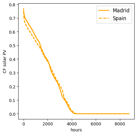
We start by plotting the duration curve for solar PV capacity factors
plt.figure(figsize=(5, 5))
gs = gridspec.GridSpec(1, 1)
ax0 = plt.subplot(gs[0,0])
ax0.plot(CF_city['solar'].sort_values(ascending=False).values,
             color='orange',
             linewidth=2,
             label='Madrid')

ax0.plot(CF_country['solar'].sort_values(ascending=False).values,
             color='orange',
             linewidth=2,
             linestyle='--',
             label='Spain')
ax0.legend(fancybox=False, fontsize=12, loc='best', facecolor='white', ncol=1, frameon=True)
ax0.set_xlabel('hours')
ax0.set_ylabel('CF solar PV')
Text(0, 0.5, 'CF solar PV')
We plot now the duration curve for onshore wind capacity factors
plt.figure(figsize=(5, 5))
gs = gridspec.GridSpec(1, 1)
ax0 = plt.subplot(gs[0,0])
ax0.plot(CF_city['onwind'].sort_values(ascending=False).values,
             color='blue',
             linewidth=2,
             label='Madrid')

ax0.plot(CF_country['onwind'].sort_values(ascending=False).values,
             color='blue',
             linewidth=2,
             linestyle='--',
             label='Spain')
ax0.legend(fancybox=False, fontsize=12, loc='best', facecolor='white', ncol=1, frameon=True)
ax0.set_xlabel('hours')
ax0.set_ylabel('CF onshore wind')
Text(0, 0.5, 'CF onshore wind')
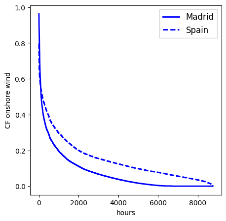
The wind capacity factor duration curve for the country shows less extreme maximum and minimum values since wind power gets smoothed by regional integration. This strategy is more effective for wind than for solar due to the shorter correlation length of wind.