Problem 3.4#
Note
This problem is mostly adapted from the following resources:
Integrated Energy Grids
Problem 3.4
Note
If you have not yet set up Python on your computer, you can execute this tutorial in your browser via Google Colab. Click on the rocket in the top right corner and launch “Colab”. If that doesn’t work download the .ipynb file and import it in Google Colab.
Then install the following packages by executing the following command in a Jupyter cell at the top of the notebook.
!pip install numpy networkx pandas matplotlib
a) Create a network object and calculate the average degree
We load the simplified dataset of the European high-voltage transmission network including nodes and edges and codify it in network object.
In this dataset, HVDC links have been left out, and the data only shows AC transmission lines.
nodes = pd.read_csv('data/nodes.csv', index_col=0)
nodes.head(5)
| x | y | |
|---|---|---|
| Bus | ||
| 8838 | -2.169800 | 53.243852 |
| 7157 | 11.927347 | 45.403086 |
| 1316 | 14.475861 | 40.761821 |
| 7421 | 4.520127 | 50.488619 |
| 1317 | 14.639282 | 40.688969 |
edges = pd.read_csv('data/edges.csv', index_col=0)
edges.head(5)
| bus0 | bus1 | s_nom | x_pu | |
|---|---|---|---|---|
| Line | ||||
| 8968 | 1771 | 1774 | 491.556019 | 0.000256 |
| 11229 | 3792 | 3794 | 3396.205223 | 0.000017 |
| 11228 | 3793 | 3794 | 3396.205223 | 0.000012 |
| 11227 | 3793 | 3796 | 3396.205223 | 0.000031 |
| 8929 | 927 | 929 | 491.556019 | 0.000092 |
networkx provides a utility function nx.from_pandas_edgelist() to build a network from edges listed in a pandas.DataFrame:
N = nx.from_pandas_edgelist(edges, "bus0", "bus1", edge_attr=["x_pu", "s_nom"])
We can get some basic info about the graph:
print(N)
Graph with 3532 nodes and 5157 edges
degrees = [val for node, val in N.degree()]
np.mean(degrees)
np.float64(2.920158550396376)
b) Add the information on the position of each node provided in ‘data/nodes.csv’ and make a plot of the network
The nodes DataFrame provides us with the coordinates of the graph’s nodes. To make the nx.draw() function use these coordinates, we need to bring them into a particular format.
{nodeA: (x, y),
 nodeB: (x, y),
 nodeC: (x, y)}
pos = nodes.apply(tuple, axis=1).to_dict()
Let’s just look at the first 5 elements of the dictionary to check:
{k: pos[k] for k in list(pos.keys())[:5]}
{8838: (-2.16979999999999, 53.243852),
 7157: (11.9273472385104, 45.403085502256),
 1316: (14.475861, 40.761821),
 7421: (4.52012724307074, 50.4886188621382),
 1317: (14.639282, 40.688969)}
Now, we can draw the European transmission network:
fig, ax = plt.subplots(figsize=(10, 10))
nx.draw(N, pos=pos, node_size=0)
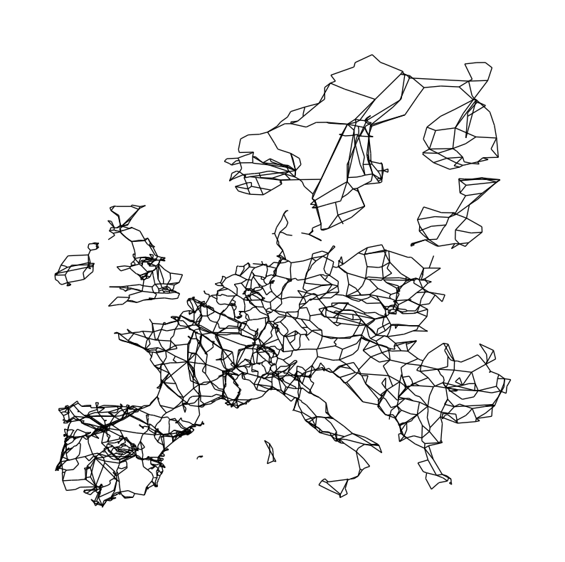
c) Determine how many independent networks exist (these are the synchronous zones of the European transmission network)
You can already see that not all parts of the Network are connected with each other. Ireland, Great Britain, Scandinavia, the Baltics and some Islands in the Mediterranean are not connected to the continental grid. At least not via AC transmission lines. They are through HVDC links. These subgraphs denote the different synchronous zones of the European transmission network. Notice that DK1 (Jutland) is connected to the mainland Europen synchronous zone while DK2 (Zealand) is connected to the Scandinavian synchronous zone. DK1 and DK2 are connected through a HVDC link.

len(list(nx.connected_components(N)))
7
Let’s build subgraphs for the synchronous zones by iterating over the connected components:
subgraphs = []
for c in nx.connected_components(N):
    subgraphs.append(N.subgraph(c).copy())
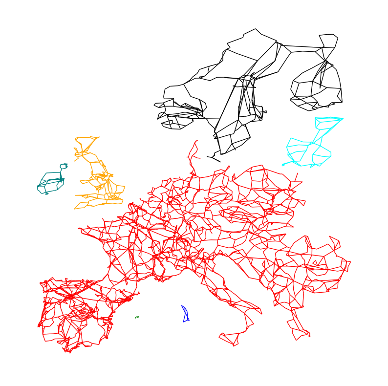
We can now color-code them in the network plot:
fig, ax = plt.subplots(figsize=(10, 10))
colors = ["red", "blue", "green", "orange", "teal", "cyan", "black"]
for i, sub in enumerate(subgraphs):
    sub_pos = {k: v for k, v in pos.items() if k in sub.nodes}
    nx.draw(sub, pos=sub_pos, node_size=0, edge_color=colors[i])
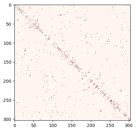
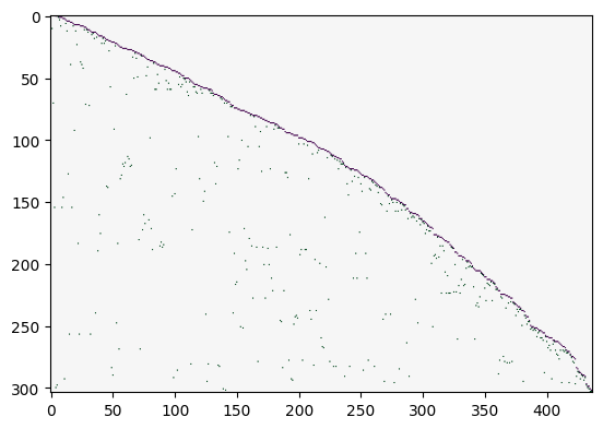
d) For the synchronous zone corresponding to Scandinavia, calculate the number of nodes and edges. Calculate the Degree, Adjacency, Incidence, and Laplacian matrices. Make a heat map of each of those matrices to evaluate them visually.
SK = subgraphs[6]
Number of nodes and edges
len(SK.nodes)
304
len(SK.edges)
437
Degree matrix:
degrees=[deg for node, deg in SK.degree()]
D = np.diag(degrees)
plt.imshow(D, cmap="Blues")
<matplotlib.image.AxesImage at 0x7f11ae917b10>
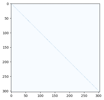
Adjacency matrix:
A = nx.adjacency_matrix(SK, weight=None).todense()
plt.imshow(A, cmap="Reds")
<matplotlib.image.AxesImage at 0x7f11a6fafc90>
Incidence matrix:
K = nx.incidence_matrix(SK, oriented=True).todense()
K
array([[-1., -1., -1., ...,  0.,  0.,  0.],
       [ 0.,  0.,  0., ...,  0.,  0.,  0.],
       [ 0.,  0.,  0., ...,  0.,  0.,  0.],
       ...,
       [ 0.,  0.,  0., ...,  1., -1.,  0.],
       [ 0.,  0.,  0., ...,  0.,  0., -1.],
       [ 1.,  0.,  0., ...,  0.,  1.,  1.]], shape=(304, 437))
plt.imshow(K, cmap="PRGn")
<matplotlib.image.AxesImage at 0x7f119988ecd0>
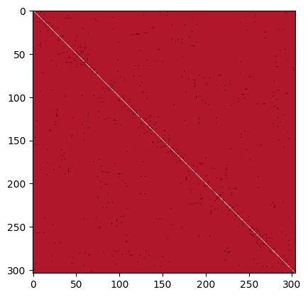
Unweighted Laplacian:
L = nx.laplacian_matrix(SK, weight=None).todense()
L
array([[ 4,  0,  0, ...,  0,  0, -1],
       [ 0,  3, -1, ...,  0,  0,  0],
       [ 0, -1,  4, ...,  0,  0,  0],
       ...,
       [ 0,  0,  0, ...,  3,  0, -1],
       [ 0,  0,  0, ...,  0,  2, -1],
       [-1,  0,  0, ..., -1, -1,  3]], shape=(304, 304))
plt.imshow(L, cmap="RdBu")
<matplotlib.image.AxesImage at 0x7f1199927b10>